I was perusing the Communication Arts annuals this past week looking at the rad stuff you folks have been creating out there. I was blown away with how much gold foil is out there right now. We have certainly seen an explosion in its use on our estimate form in the last year, so I guess I shouldn’t be too surprised. But sometimes the flow of estimates distracts us, and we don’t pick up on trends as quickly as we should.
Don’t let your design work get foiled… or do?
Some things to remember when designing for printing:
1. Keep the lines at .5 or greater or they can break. And keep any cutout at .75 or greater.
2. It is going to cost you more than ink. The foil dies are about 10x more expensive than the polymer plates. (And the larger the plate the larger the up front cost)
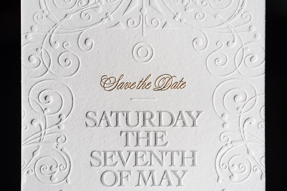
3. When printing fine need-to-read details it is best to use a less metalized foil so that the light doesn’t make it unreadable. (We can certainly help make the right choice.)
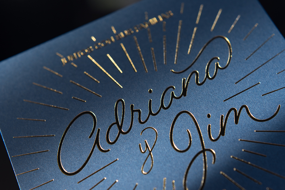
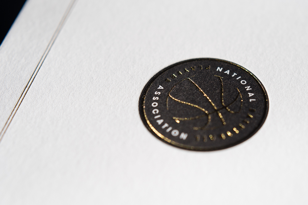
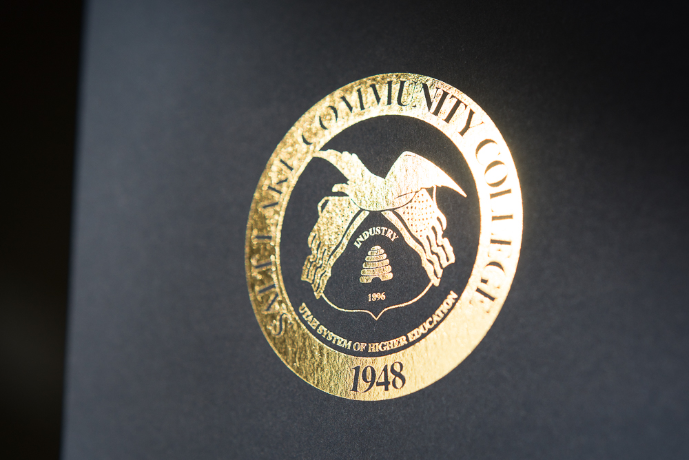
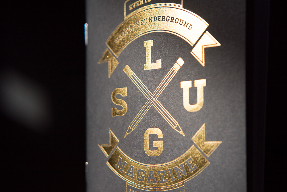
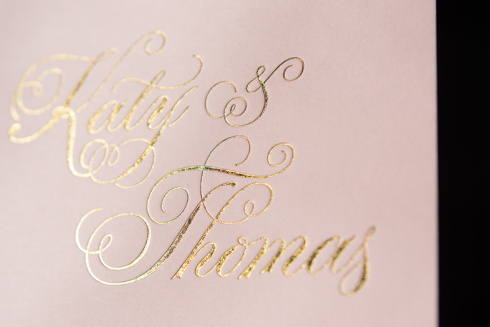
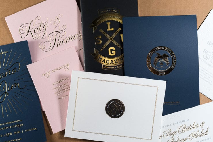
4. Gold foil looks great on every color of paper from bright white to deep black.
5. You aren’t going to get as large of an impression with foil as you would with ink, but there is still some texture there.
That about covers it for a small blog post about letterpress foil. If you have something you are working on, send it over in our estimate page and I can give you some pricing as well as some suggestions to make it the project of your dreams.
/Peter