
It is wedding season again.
Which means we have the privilege of welcoming all you excited and nervous brides and grooms into the shop. I will leave the advice of living a healthy and blissful life as a married couple to your (what I assume are) delightful relatives. However, a few words of advice on the invite:
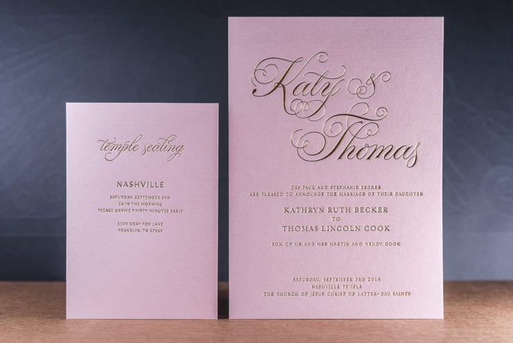
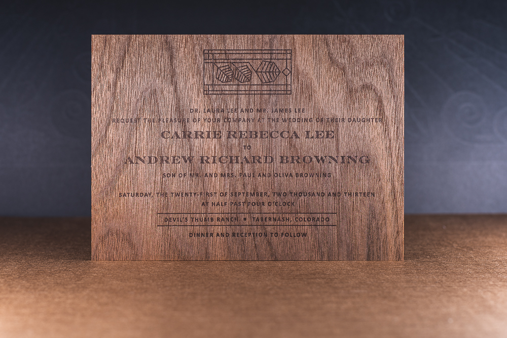
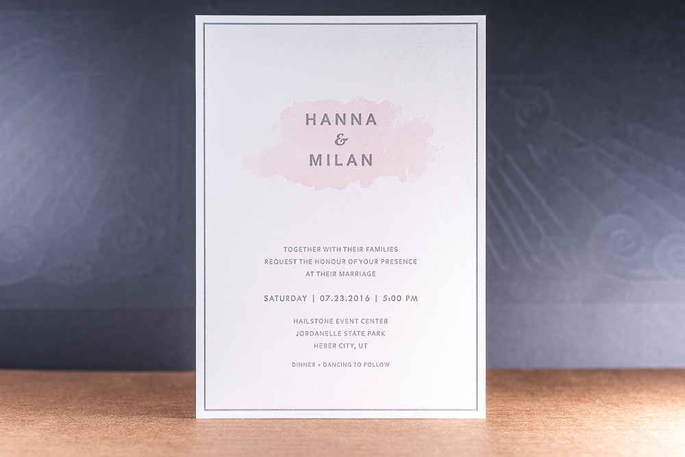
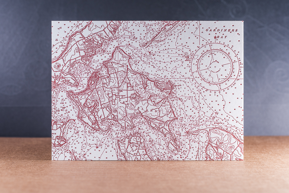
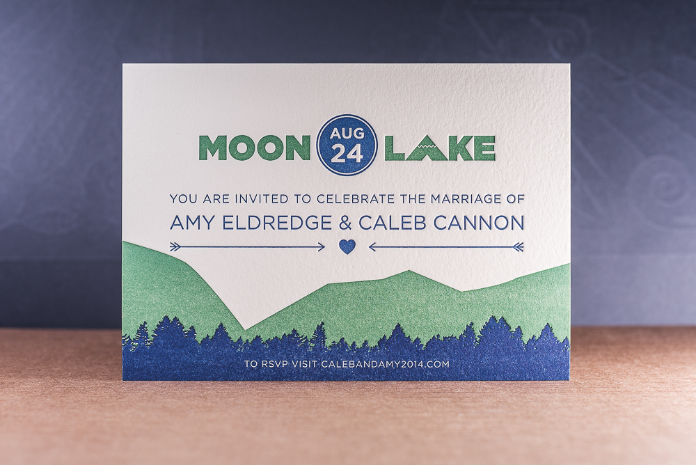
1. Think twice about the invite size.
Everyone gets a 5×7 invite. If you want to stand out, do something different. I would recommend something that you can get an off the shelf envelope in. I really like the A9 size of 5.5×8.5 as it remains mailable with a first class stamp, but dwarfs the other invites on the fridge. Another size I would suggest is the 6.75×6.75 square invite. This will allow some fun design elements that you don’t get on a rectangular card. Don’t make your invite boring.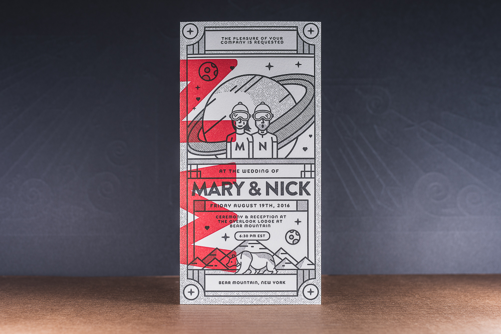
2. Change the process.
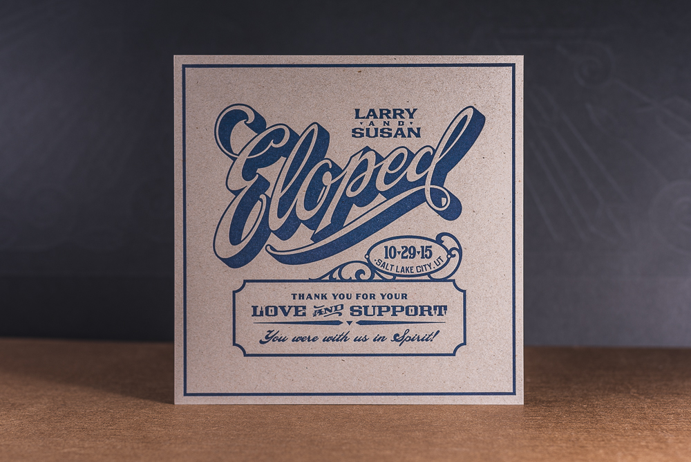
Most of the invites I get these days are printed digitally… and there is nothing wrong with that technically, but there is something wrong with doing what everyone else is doing. I clearly love letterpress, but there are also reasons to consider engraving and offset for a change of pace. If you’re really thinking outside the box, adding an emboss/deboss or some blind letterpress elements will make your invite and event stand out far more than your cousins. Trust me.
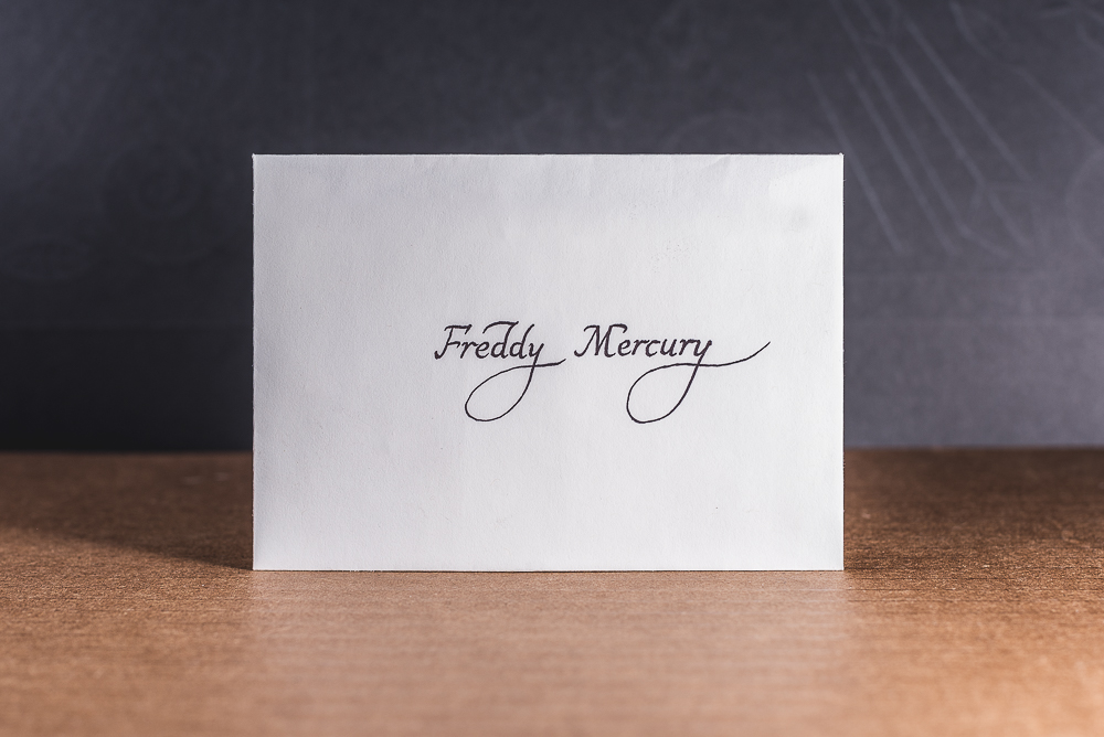
3. Use a calligrapher.
These people are talented and will give your invite a chance to stand out without costing a fortune. We often find that the fonts used on wedding invites are by far the most troubling for couples. They fight and scour the world for an existing font that has just the right A or D… maybe it does, but doesn’t have the right lower case aesthetic. These problems get ironed out a whole lot more quickly, and easily by hiring a local calligrapher. Again, trust me on this one.
4. Drinks go unbelievably well with addressing invite envelopes.
Handwritten envelopes are annoying, but doing it is worth the trouble. You create a warm personal handwritten touch that a laser printer will not give you or your guests. Why pay all this money to print this beautiful invite, only to make it look like junk mail? You wouldn’t. So don’t do that. Buy some champagne and set aside a night or two to address and assemble all the envelopes/invites.
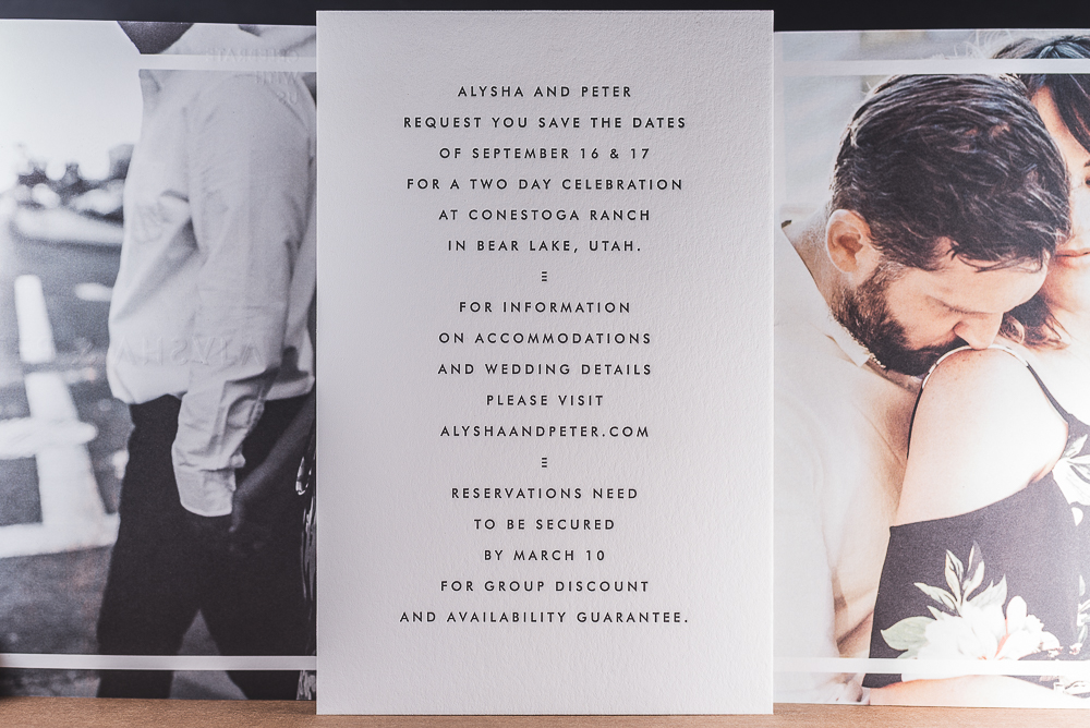
5. Don’t print your photos at Costco.
A 5 cent photo from Costco is going to kill how great the rest of this is going to look. Consider alternatives, like a digital print on uncoated paper. (The folks over at Artifact Uprising are doing similar, rad stuff) But honestly… with the world wide web and all the social media out there… why even include a photo at all? Do what you are going to do, but just don’t do the wrong stuff. We can help.
/Peter