
Killing it with type.
Designing for Letterpress
Chances are, you want your letterpress printed piece to have letters, and/or complete words. This is a good idea, good work so far! Now you just need to put those words into a design. Here are a few tips on how to do that while avoiding some common type errors. The last thing you want, is for your carefully chosen words to come out less than perfectly clear. We’ll advise you if you send us a design that won’t reproduce well, and we can even help with adjustments if you’d like. Here are a five pieces of advice to help you get started.
Invisible words.
The deboss debacle.
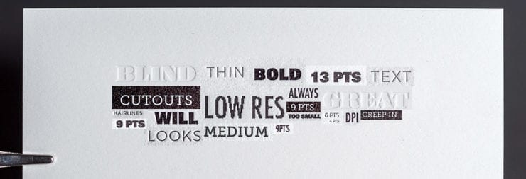
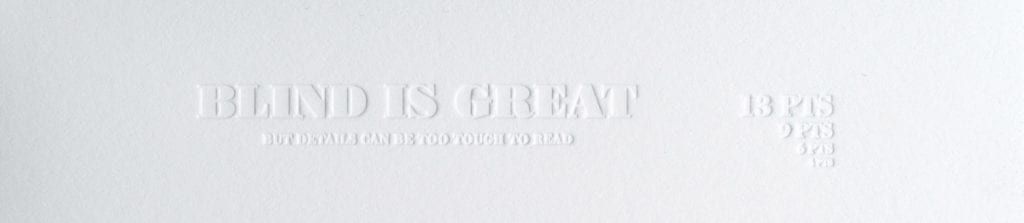
No doubt about it, one of the most appealing features of letterpress printing is it’s impression, and it’s all the more impressive when it’s inkless. People often call this a deboss, or blind deboss. (We like to call it a blind impression to avoid confusion with the emboss/deboss process which is something else.)
We recommend printing large, non-essential type in blind. The deboss effect looks great under the perfect light angle. If you don’t happen to live in a perfectly lit world, where light is always glancing off the surface of your paper at around 170 degrees highlighting the ridges, valleys and paper texture, important information like phone numbers or less important info like your name can be hard to read and harder for people to make use of.
Tiny Headlines!
Read all about it, if you can.
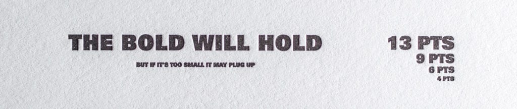
Some fonts are classified as display, or headline fonts. These fonts are often fat, bold, condensed or sometimes very decorative and they are fantastic at 24pts. At 6pts… not so much. Tiny details can get “muddy” on press and the counters, or spaces in the letter can start to become less clear. Even simpler fonts can get too small to print clearly in letterpress. I always recommend printing out your artwork at actual size (uncheck that damn “scale artwork” button in your print dialogue) for your final review before sending it in. A standard home printer will give a decent idea of clarity.
Disappearing Hairlines.
Receding details.
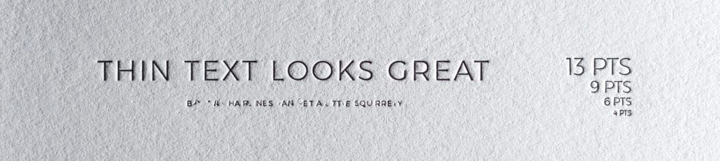
On the reverse side of that problem are fonts that are too thin like hairline, light or thin weights. Thin fonts (or lines for that matter) can be too thin for us produce a printing plate of. We can make adjustments and advise you as needed, but a good rule of thumb is that lines and fonts thinner then .35 pt may be problematic. Your best bet is to choose a simple, font and appropriate size, generally no smaller then 6 pts, for fine type and information, everyone will love being able to read it.
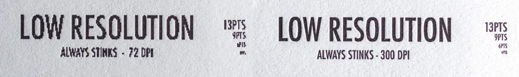
File Formats.
Highly resolved for high resolution.
Even if you’ve made all the best choices for your type but were to give us a 72 dpi jpg of it, you wouldn’t like how it prints. Luckily for you, we won’t print a file like that; We like you… and ourselves too much. Our favorite files are vector files like Adobe Illustrator makes. If you aren’t sure how to make your fonts vector send them to us with the type live and unflattened and we’ll take it from there. The next best format is rasterized file with a resolution of 600 dpi-1200 dpi. It’s pretty large file, but it keeps your files clean as can be. PDF is a preferred file type. If it has to be a jpg, just make sure it’s much bigger than needed and we can help with the rest.
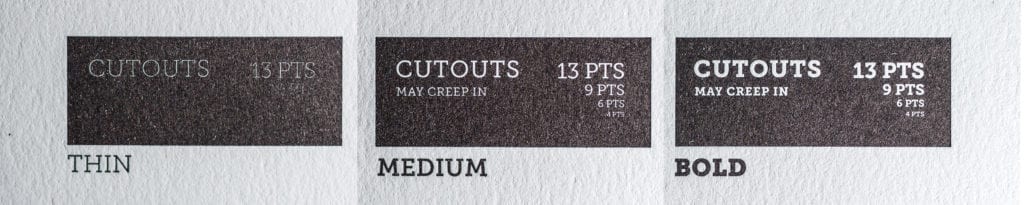
Using negative type.
Getting positive results.
Another unexpected letterpress quirk is cut-out type. Cut-out type is type cut out of a printed flood of ink. For example: a black box with white type in it, where the black is ink and the paper is white. Ink tends to creep into those negative letters, making your type a little less present. Instead go with a medium to bold type that will stand up well in the printing process. You’ll see a little less of the letterpress impression (or ‘one-sided deboss’) when printing type in this way since a larger portion is being pressed in.
That may be just the tip but it’s enough to give you a great start. Give us a call if you have any questions come up, we’re always happy to review artwork and offer opinions.