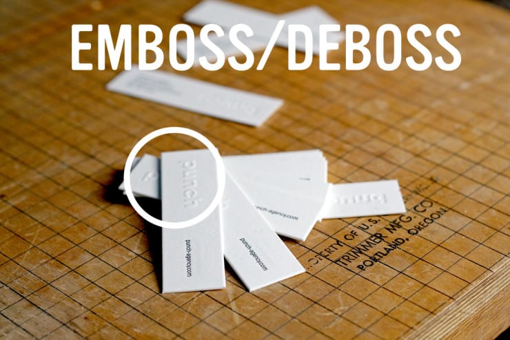
We end up having the discussion around here at least once a week about how best to use the same vernacular as our clients when it comes to embossing, debossing and blind letterpress. Do we use the same terms that the rest of America is using to describe what they are doing? Do we try and educate all comers? Do we write a blog post about it? Does anyone even read blogs anymore? It is more than 160 characters… So clearly unreadable. But here you go, definitions and pictures to help explain the differences between Emboss, Deboss, and Blind.
Emboss
Emboss. Raised letters. Pressed from the back side and up. Always leaves a deboss on the back side. So you get an effect on both sides. One raised (emboss side), one pressed in (debossed side). Does that make sense? Here are pictures to help illustrate what we are talking about: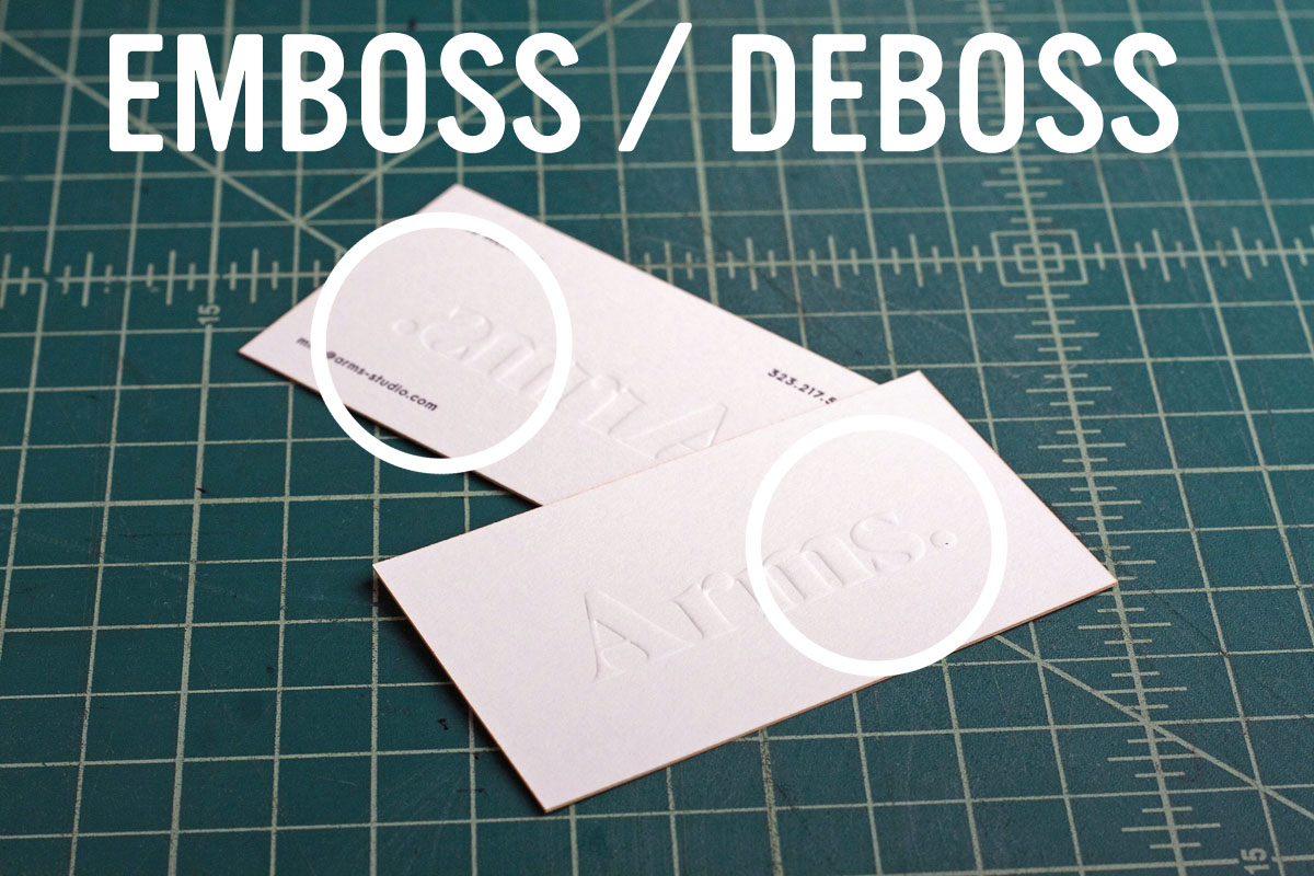
Deboss
Deboss. Lowered or pressed in letters. Always going to have an embossing on the other side. Basically reverse side of the emboss.
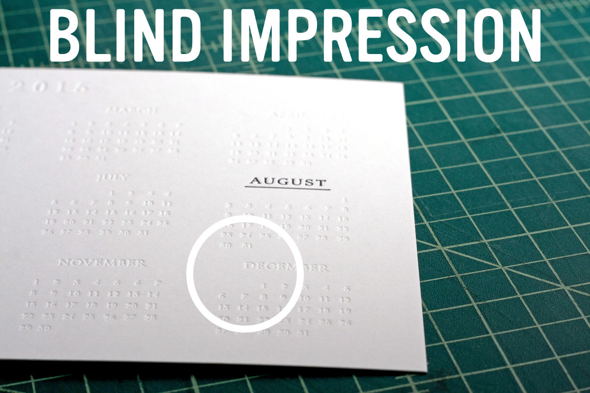
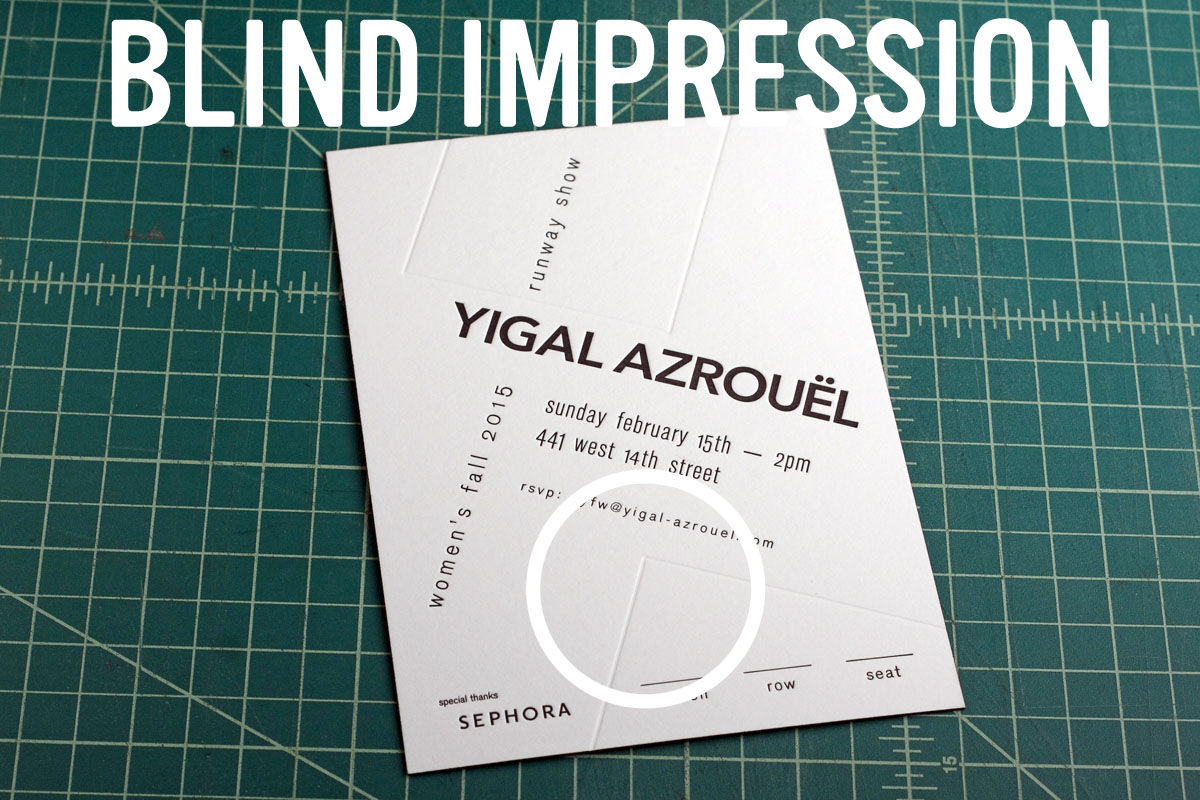
Blind
Blind Letterpress. This is the one that we get most requests for. But most people call it a blind deboss, deboss or an emboss. This is exactly like adding a color to a letterpress piece. But instead there is just no ink. So it leaves an impression pressed into the paper. But doesn’t press through the other side. Like a deboss/emboss would. We love doing this with the right design.
All three of these are inkless design elements that you can add to a business card, invitation, or any other project to give it a texture and appearance that will push you it to the next level of greatness. If you want some help in whether your design could use one of these elements, just contact us. We geek out about this stuff.